Haldiam Logo Analysis: ‘Haldiram’ is a common name in Indian households as every Indian must have tasted some or the other food product in their daily routine. Whether it is namkeen, sweets, beverages or cookies, the brand Haldiram always comes in the consumers’ mind.
Initially Haldiram was a small namkeen shop founded by Mr.Ganga Bisan Agrawal (haldiram), in Bikaner which was founded in 1942, later this brand grew multi fold by the efforts of the Founder member and their team.
The brand got registered in Delhi with the company name as Haldiram India Private Limited in Delhi. Slowly and steadily the company grew rapidly and now it is handled by their 3rd Generation – Grandson Mr.ShivKisan Agrawal.
Let’s drive into the detailed analysis of Haldiram Logo.
Shape and Structure of Haldiram Logo
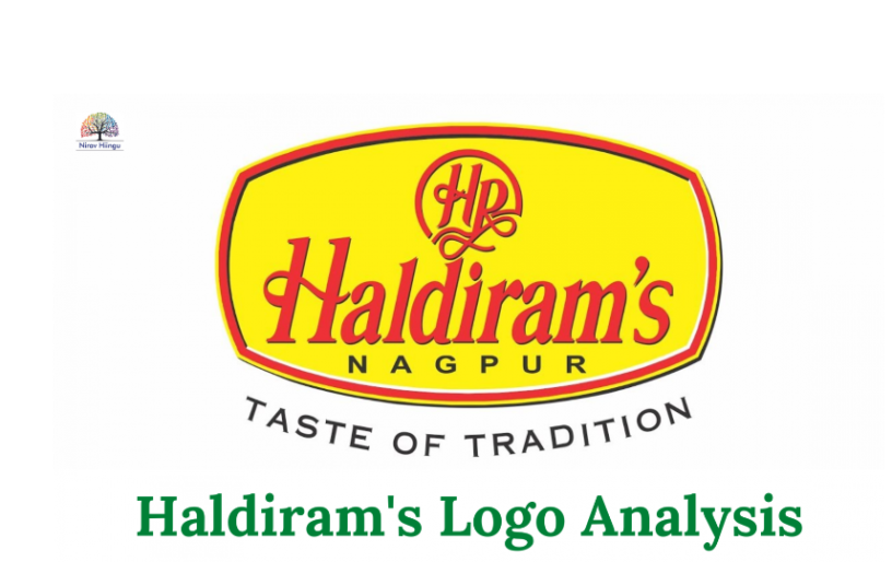
The shape of the haldiram’s logo is oval which shows they are always ready to adapt to the new changes of the Indian and overseas market. Such companies are also flexible and can change their strategy and needs as per the market trends.
The oval shape in Haldiram Logo also shows the highly image conscious brand
hence they will never ever let themselves fall down on brand values and hence the quality is always their high priority. They will make sure the quality control check and the operation and timely delivery always happen.
Haldiram Logo in Rectangular (Curved Shaped) Structure also depicts decision making by middle and top management, therefore there are chances that the company will stick to their plan and execute as soon as possible.
They will make sure they always launch the trending product in the market and they are always envious of their rivals.
The Curved Shaped logo of Haldiram also says the presentation part is excellent hence their outer packaging, the font and design is always taken care of by the product management team.There would be a separate Design Team who would take care of the design and colour aspect as the structure show the concern for their baby and parent brands.

Semi Circular Shaped in Font HR of Haldiram Logo
The semicircular shape shows the covering of the facts and data from the vendors and suppliers, it is quite possible that Data is always hidden even from the internal customers, i.e their employees.
70 % of the circle is covering the font which is also cursive hence the company may take time to complete certain tasks and the response rate to their vendors, supplier and distributors is quite slow.
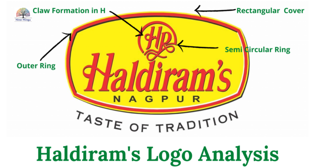
Outer 3 Layer Ring in Haldiram Logo
These 3 rings in the outer part of the logo show the extra layer and protection shield for the organization. The management will take care that there are no disturbances from the external forces.
Claw Formation in Font HR of Haldiram Logo
There is a formation of claws in letter H which has a sharp curve moving from right to left. This sharp claw depicts the cheating traits in the organization.
Therefore these traits show the 3rd party companies of Haldiram, their stockist, super stockist, vendors and other suppliers will have to suffer from severe outstanding and timely payments.
There are high chances that the company will give a limited time slot for credit period, payment and inventories.
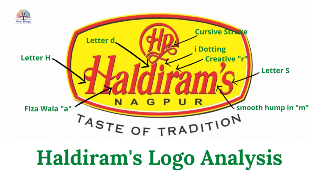
Slant in the Haldiram Logo
We can clearly see the B slant in the logo which also conveys
the message of expressiveness and communicating with their target audience. Since it is the B slant the company is very good at connecting with people, through their ad campaigns and creative packaging.
Cursive Structure in Haldiram Logo
We can see that there is a starting and ending stroke in the HR letter in the upper part of Haldiram’s logo which shows- there are never-ending disputes and unnecessary stretching of the topics which are not at all required. This further leads to lots of anxiety and stress among the team members and also with the core team.
Entanglement in the Letter H of HP and small letter “d” in Haldiram Logo
Although we have seen the company is growing multifolds and still expanding its wings to different segments as well as importing and exporting to a wide range of nations. The entanglement shows there is a time management issue with certain tasks, wherein their managers are unable to give priority on certain projects and this is happening in the middle management team, Thus the timely completion of the project may become the issue in their managerial level cadre.
This starting and ending stroke also shows rude behaviour with their executive and lower management.
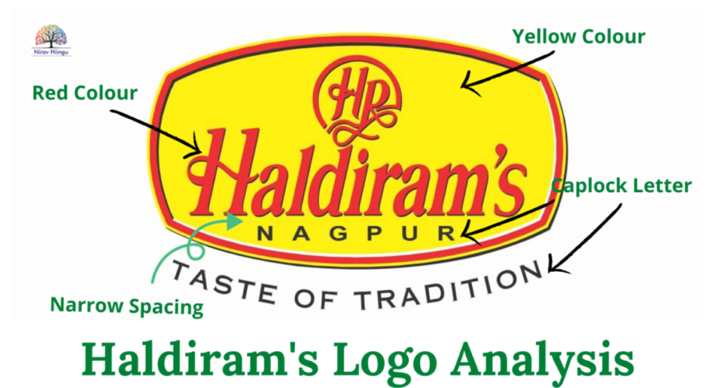
Capital Letter in NAGPUR
The font under the Haldiram is seen in Capital Letter to depict self-centred behaviour and such organizations always take feedback from their market/customers. Thus, they will improve their services/product based on the feedback based on the data given from the market research.
The company Haldiram will take care that daily routine will follow and then there will be a systematic structure. There will always be a strict protocol in the company.
The Capital letters also depict good brand positioning in the segment. This letter helps Haldiram for better brand recall value and thereby gives them good attention in the public.
Narrow Spacing in the Font between Haldiram and Nagpur
When there is a narrow spacing in the font of Haldiram & Nagpur, this shows the top management is getting disturbed with multiple work strategies and there is a high chance that management is sometimes unable to give priority to flow of work, thus there is a delay in the delegation of the work.
This time management is a big issue in Haldiram especially with the top management team such as Vice-President, CEO and other board of directors.
Letter in the Haldiram Logo
H – The letter h shows the learning attitude of the team, hence the core team would learn from their own failure. Since, the Letter”H” also shows the sign of spirituality, this company will tend to follow the strict rules and regulations in their team (upper, middle and lower management) – except one flaw is seen as a Claw in letter H of HP.
A – The small letter a in Haldiram’s Logo show the fiza wala “A” which says , such company won’t believe in the verbal communication, they always need a strong proof or validation, in written format, hence the company – Haldiram Core Team will launch any product after going through the in depth analysis and detail research of the said market.
This letter also shows the skeptical nature of the company wherein they do give the space to the people but at another time, they also doubt their own employee/team.
L – Letter l in Haldiram’s logo shows the data consumption and data munching and they won’t waste the resources and money on unnecessary material ( retrace letter “l”).
D – Letter d in Haldiram’s Logo show good presentable nature in the core team, these d letters also showcase the excellent grooming and time working of the team.
I – Letter i in the Haldiram’s Logo show takes an action based on past experience and resources. These letters I have dotting close to the stem hence such a company is seen taking their major decision quickly but also based on intuition.
These types of i dotting are rarely seen in humans and specially in the brand haldiram logo.
R – The letter ‘r’ shows high creativity and high clarity as what to do and how to do? The letter r also depicts the restoration features of the company that mean company Haldiram will store and recreate the products and data for their future projects.
M – Letter ‘m’ is a complete letter in Haldiram’s Logo as there are no cuts and curves in the letter. This structure also shows taking lots of data and utilising it in a timely manner.
The MacDonald’s “M” also show the same behaviour pattern, wherein they will launch the product in a small team and region, once they get success, then only they will launch it on a larger scale or nationwide.
S – Letter “s” in the ending of the Logo, show the smooth and organized working structure, but there is also a slight hook seen in the logo in letter ‘s’ hence such people or companies love to talk or to have a noisy atmosphere in the surrounding. Therefore, there is a probability that a company office or plant would also be located in noisy areas such as hospitals, temples, mills, schools, colleges or railway lines or airports etc.
Colour Combination in Haldiram Logo
Yellow Colour – Yellow is the colour of knowledge, wisdom and spirituality. Since, this colour is governed by planet Jupiter, the company acted whole-heartedly with their employee and also went for in depth analysis of data before launching the new product.
Yellow is also the colour of distribution, friendly in nature and public hence their audience get easily connected with their other brand not only due to colour but also due to hard core marketing strategies.
Red Colour – Red is an aggressive colour which shows there will be high enthusiasm among the team members and there is also domination of their industry because red colour is also responsible for domination, anger and confidence.
The red colour gives a big boost to their sales and marketing team and it also shows the intense passion and high energy to achieve their goal to establish themselves as pioneers in the namkeen and sweet segment.
Conclusion: Overall the company – Haldiram’s Logo shows high growth but with its limitations and structure. Due to the flaws, the company may see decline in their businesses later.
My best wishes to the company –”Haldiram”.
Let me know, how did you find the article on “Haldiram Logo Analysis”?
Regards,


Leave a Reply