Google Logo Analysis
In my last blog, i have analyze Meta also known as Facebook Inc Logo analysis, Today, I will analyze the world’s largest search engine, which needs no introduction to us,in depth . We all use this company’s products on a daily basis.
So let’s drive into ‘Google’ which has become an alternative word for ‘search term’ in every human mind. But before analyzing Google Logo, let me give you a brief introduction of the world largest Techno Giant Company and its history.
What is Google ?
Google LLC is an American multinational technology company focusing on search engine technology, online advertising, cloud computing, computer software, quantum computing, e-commerce, artificial intelligence and consumer electronics.
Source : Wikipedia
It has been referred to as “the most powerful company in the world” and one of the world’s most valuable brands due to its market dominance, data collection, and technological advantages in the area of artificial intelligence.
Its parent company Alphabet is considered one of the Big Five American information technology companies, alongside Amazon, Apple, Meta, and Microsoft.
Google was founded on September 4, 1998, by Larry Page and Sergey Brin while they were PhD students at Stanford University in California.
Together they own about 14% of its publicly listed shares and control 56% of the stockholder voting power through super-voting stock.
The company went public via an initial public offering (IPO) in 2004. In 2015, Google was reorganized as a wholly owned subsidiary of Alphabet Inc.
Google is Alphabet’s largest subsidiary and a holding company for Alphabet’s Internet properties and interests.
Sundar Pichai was appointed CEO of Google on October 24, 2015, replacing Larry Page, who became the CEO of Alphabet. On December 3, 2019, Pichai also became the CEO of Alphabet.
What is the meaning of the Google Logo Analysis?
As we all know that Google is a leading Internet search service, offering a variety of search products and services. Google Search is one of their most popular services offered on the web.
The search engine’s logo consists of a stylized “g” in green on a white background. This logo has been used since its initial release in 1997, though the (old) design did have some minor differences from the current one.
The Google logo is composed of three main elements:
1) A perfect circle within which 3/4ths appear to be filled with Red and Yellow color.
2) A smaller circle which 1/4th of the area appears to be filled with Blue color at Capital Letter G.
3) A small,green coloured letter “g”center after Google doubles it when down-sized to a more compact look.
4) A Sharp Angular Letter l which stand firm in google logo
5) A small red coloured letter ‘e’ which is angular + smooth curve on the right side gives perfect shape for the ending structure of the logo.
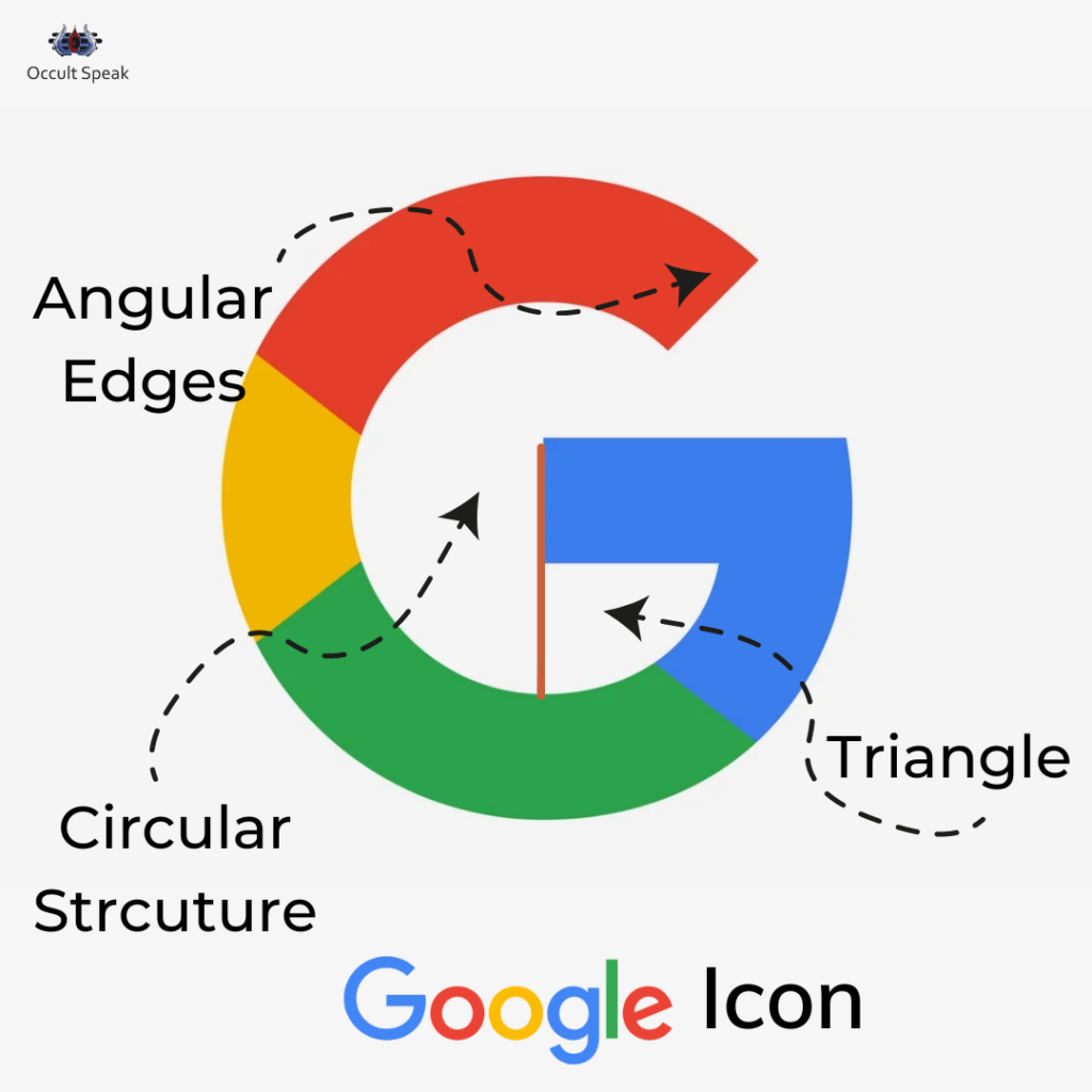
What is Google Logo Now ? (Google Logo Analysis)
The logo of Google is a green triangle with words, “Google” in white inside it.
The triangle seen in the letter G of Google refers to an image (showing intelligence, data sharing, and data-mining) used to represent knowledge and innovation, which is fitting for Google, which collects information from the whole world.
You can see how the company has used this to design its products, such as “Google Chrome,” “Google Desktop,” and even products that do not exist yet like “Project Loon,” which show how new the company is and how much potential it has in front of it.
The colors yellow, blue and green are present in all of their products as they are usually associated with technology and innovation.
Now, let’s drive into the analysis of each and every aspect of letter colouration of Google Logo Analysis.
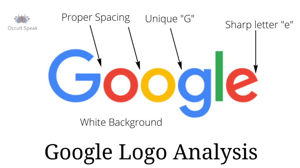
Letter G of Google Logo Analysis
Letter G in Google has Triangular shape inside the G. If we visualize and see the horizontal stem in the middle zone, it shows there is always lots of data to punch, analyze, redesign and keep evolving with time, this makes perfect structure as per the company’s vision and mission.
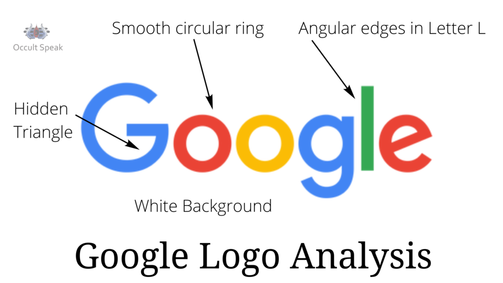
Letter O from Google Logo Analysis with a red and yellow ring:
These 2 Letters show the company’s urge to grow worldwide and reach out to every corner of the world as yellow ring color in the letter to show information, friendly in nature and reaching to the people without any fear and security.
The Red Colour Ring in letter o show the steadiness and alertness in the team, also depict the company want to stand away from crowd hence there are high expectation from people in the team and there can be possibilities of aggressive working with tight deadline on every project(s)
This red coloration also symbolizes a deeper desire to become and remain a market leader in their niche (search engine and technology) (small G).
This letter is unique in its own way, as there is no completion of the loop of g in this Google logo analysis. According to Logo Science and Graphology, incomplete loops in g, j, and y indicate incomplete tasks, which can lead to anger and frustration.
So, why is there a hook at the bottom of the g in the Google Logo Analysis?
The Company Google is into detailed analysis and research work also hence when a company wants to go deeper into any aspect it has to move beyond the limit. Therefore the company Logo has kept g in the loop with incomplete loop to peep in the lower zone (research work) to know about the hidden truths.
Blue Colour in letter g in Google Logo Analysis
That shows the calm and composed nature and strong intuition and observation. Therefore the top management won’t compromise on their principle and will hire the best candidature and product for their team
Blue color also stands for keen observation and judgemental skills.
Letter L (small l) in Google Logo Analysis
Since the letter l in English alphabet is in 12th position which shows the steadiness, firmness and also learning abilities of the team, this letter also depicts a deep learning curve wherein the company will spend enough money on research as well as on latest updates for self and for the employees.
The sharp edges in letter l show sharp edged technology and a team of intelligent people who value their time and resources.
As a result, they have retained the G structure with green coloring, which represents intelligence, information, coordination, and alignment with the company’s future vision.
Green is also the color of calm, cool nature, and healing properties. The company logo shows that employees will work with aggression and passion, but with proper strategy-making that gives soothing results and effects to their end consumers.
Letter E (small e) in Google Logo Analysis
Letter e in the Google Logo gives the feeling of a camera, an eye which looks very precisely toward the future, hence the company google logo shows that all their communication, thought, habits and actions are futuristic, looking for the next 5-10 years down.
The Company Google Logo and team has high expectations from others in terms of quality and quantity hence the listening skills and communication is good among the team members and experience and working culture would be amazing.
Logologo really made it’s uniqueness with simplicity and sophistication.
Overall, the Google logo is stunning, highlighting the company’s excellence and unrivaled work culture in the tech world.
Let me know how you perceive the Google Logo analysis done in this article.
Curious to know your views in the comment box of this post.
Light & Love,
Logo Analyst


Leave a Reply