What is Logo Analysis?
The logo is a subconscious representation of any organisation, vendors and its owner’s mindset. Whenever we see a company’s growth or decline, there would be a reason in the formation in their respective logo. Read below to understand what is reading for Zomato Logo and Swiggy Logo and get insights into the Science of Logo Analysis.
Logo Analysis: Zomato Logo
Zomato: The Indian restaurant finder and food delivery platform founded in 2008 by Mr. Deepinder Goyal and Pankaj Chaddah. The business was started with name FoodBay which later got renamed ZOMATO in 2010. Zomato has been a Pioneer in the food segment and was the market leader in food-delivery App.
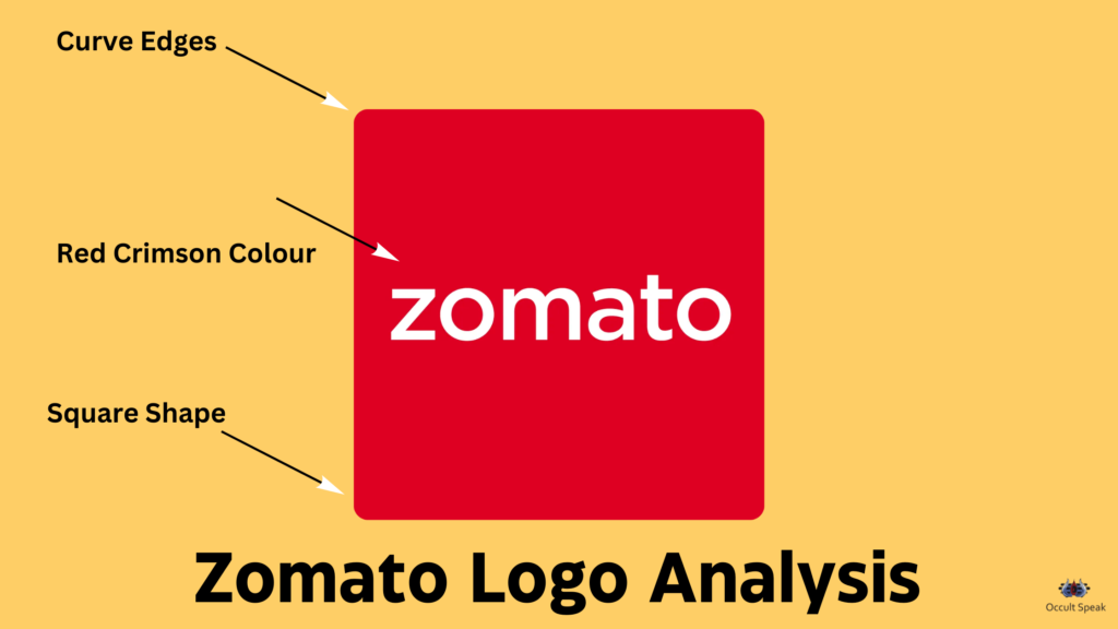
Shape and Structure of Zomato Logo :
We can see that the shape of the Zomato logo is square which shows the stability and a good ground prospect for the founder and its stakeholders. The square-shaped logo means you are always looking for faster but steady growth.
The squarish shape logo company walks on the structural way, they do lots of research and development before launching any type of product or brand. There is a good ratio of coordination, execution and planning.
Therefore, we can see Zomato has seen steady growth in the last 10 years.
Curves at Edge of Square: Square shaped look is very angular but it is soft at the edges hence such type of businesses or companies are very soft and polite with the employee and stakeholders they will not take any decision or action on a faster way rather they will take in a very mild way.
Edges and Founder Members: Due to the edges in the logo, the Founder member of the Zomato sometimes will be unable to take decisions and might be very harsh In actions which is not required. Sometimes, when there is a need for strict action, the Founder members may become very soft and polite in action.
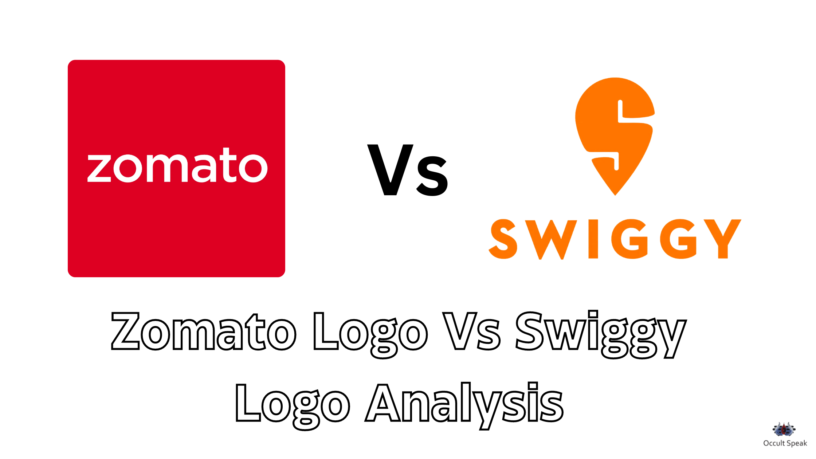
Red is the colour of excitement and aggression. We can see the colour in the Zomato logo is red. The logo colour suggests that the company would be very aggressive and good at the execution. Hence we all have witnessed the remarkable steady growth of Zomato compared to rivals like Swiggy and FoodPanda and Uber Eats.
“The red colour red is associated with Planet Mars which is the leader in numerology and astrology hence the company having the right colour. Such a logo always takes the initiative, faster action and will always think out of the box with creating a new market.” – Nirav Hiingu
Red Colour is colour of creation and leadership hence many companies such as Airtel, Vodafone those having the red coloured logo are very good at the execution and these above-mentioned companies have ruled and lead the market in their respective field and segment but sometimes it may also lead to loss of anger, frustration and instability among the employees and management.
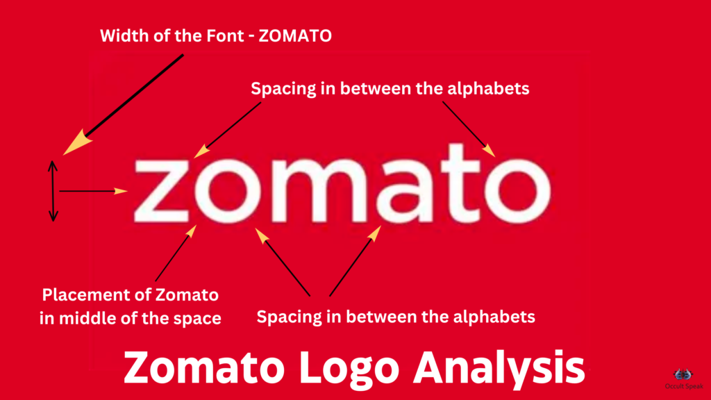
Placement of font Zomato:
In the middle of the zomato logo: Zomato is written exactly in the centre of the logo which shows the customer will always be happy with the services of Zomato because, the middle part of the logo shows practical approach, clear vision and straight driven action of companies.
Space between the letter:
Spacing between the letters in the word Zomato is even and the width and length are also quite good which show their organizational skills and accuracy in their projects.
The letter “A”- Letter A in Zomato is Fiza (as said in Graphology) which means that this company believes more in practical work, hence do not believe anything in verbal communication. The CEO and Senior Management always need Verification and written proof at every step.
This also shows the company believes more in the in-depth analysis of every brand and strategies.
The letter “T”- The letter T letter shows the pride and ego of the company. They are too good in the execution of strategies plus believe to create new niche products and be ahead of their rivals. Hence, they feel they are a pioneer and proud of their company, name and fame and their ego should be satisfied.
The letter “M”- The small letter ‘m’ in Zomato resembles the shape of Macdonald’s M, which indicates that the company launches its brand and project on a small pilot mode first and once they are happy with their pilot project, then they launch on a larger scale. Hence the detailed analysis, gathering information from the market and launching with extreme care are a few of the best policies of Zomato.
They are very good at taking calculated risks.
The letter “O”– The letter O stands for energy, flow and money. Since money is said to be energy manifestation, Zomato cash flow will always be proper and uninterrupted.
Conclusion: Zomato, as a Company will keep rising every year. Since the red colour in zomato logo depict domination and aggression as red is the colour of aggression as mentioned earlier. However, there are chances of controversies and disputes among employees and management. We have seen many times, the controversies are created to spoil the name and malign the image of the company.
Logo Analysis: Swiggy Logo
Swiggy, another food delivery app, founded by Mr. Sriharsha Majety in the year 2014. They gave a tough fight in the food delivery segment to Zomato. Although the revenue generation and growth are much faster compared to Zomato they are a few loopholes in their current Logo.
Let’s start analysing Swiggy Logo analysis for Company – Swiggy.
Swiggy Logo is Letter and Word-centric logo with Elongated Letter S in Orange Color.
Letter Centric Logo with Huge Formation always depicts Attention-Seeker character hence we can see that Swiggy although enters the market after Zomato but still covers a huge market which was untapped in tier 2 and 3 Cities.
The shape of Swiggy Logo:
The Upper Portion of Letter S is bigger than the lower one, hence this company goes more on the planning and strategies-making.
Also, we can see the lower part is pointed and squeezed which show there is lots of anger, a difference of opinions in the top management of the company, maybe the stakeholders and the Board of Directors are aggressive in their talks/discussions and actions.
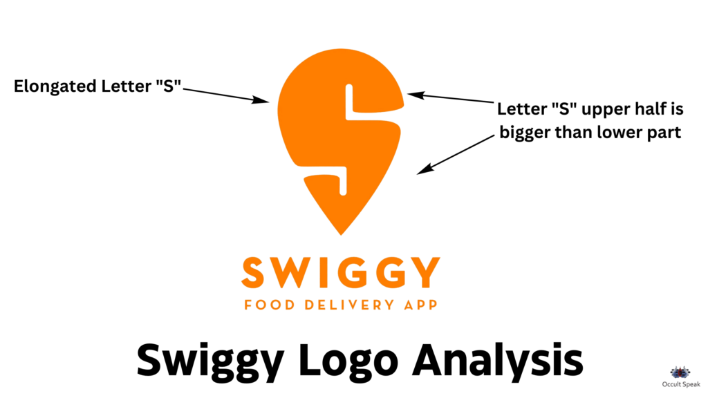
Sharpness in Letter “S”: This shows faster execution as lower part/zone shows Execution and actions, hence the execution would be faster than their overpart – Zomato Logo.
Zomato has been an organised company, creates a full plan and market research data but slow in growth, on the other side, Swiggy is faster in action and planning hence they grasp the untapped market of India.
Colour in Swiggy Logo :
Combination of White and Orange Color shows a good combination, coordination among the staff in operations but the Lower Management, i.e Delivery Boys would not be that happy as the operation staff.
Orange: Orange colour gives high ambitions, energy, zeal and extreme enthusiasm but a pointed portion in the lower part of the letter creates lots of mental disturbances in the Delivery Staff. Although the delivery staff may get a higher incentive in comparison to other departments they have to run on their toes every single hour on the field.
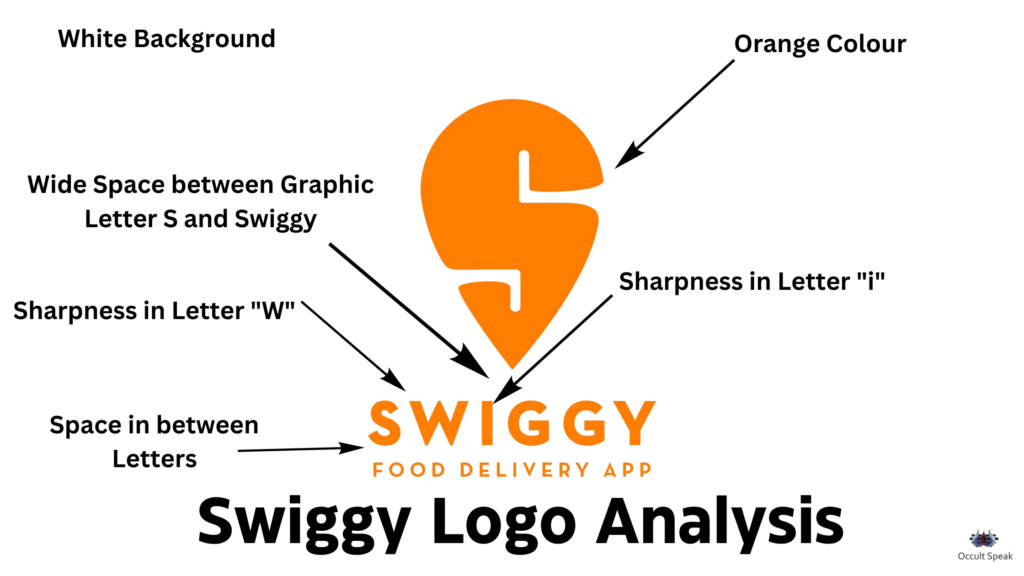
“White colour is the planet of imagination and calmness hence this organization works with a good combo of planning and faster actions.” ~ Nirav Hiingu
Space: Narrow space in S letter in Upper part of right side show limited access to prospect and client. Hence, customers are unable to view or access the policy of this company. Even the supplier chain management is always in a dilemma and mystery as what will be the next step of this company. There is always a big suspense for this company. You never know that the company may take extreme high risk and may merge into another company.
Narrow space in the Lower part of Letter “S”: Space shows that even the operational staff has to work 12-14 hours /day with the limited period to rest and feel no growth in term of incentive, salary, or yearly bonus.
Very limited operational staff or middle management are getting access to top management- bosses hence the company always keep their trade secret within the limited Executives.
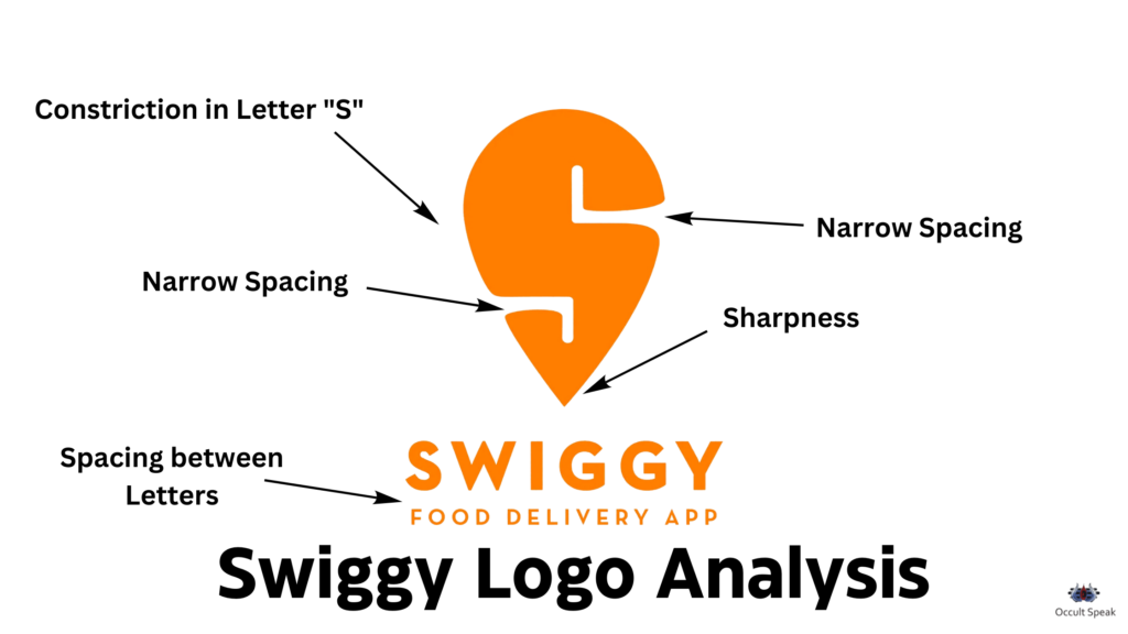
Cash Flow: As mentioned before, the company will have a good flow of money due to a proper plan of action and execution. The placement of letter in Swiggy Logo is always well prepared with Letter W having sharpness hence the few female staff would have a good holding in the company and they may hire the staff with high salary from a reputed institution.
Letter I – This letter is called as Independent Letter as PPI in Graphology which is standing alone hence the company may have started with booth strapping and have grown multi-fold with individual help from others.
Conclusion: Letter stands for money, flow and wealth creation, hence lots of funding and opportunities are seen in Swiggy Logo which gives enough profits in upcoming years to its owner and stakeholders.
Looking forward to your thoughts or comments.

Leave a Reply