

Logo Design Analysis: PayPal Logo
Analysis of PayPal’s Logo Design One of the most recognizable symbols in the digital banking industry is the PayPal logo. Being one of the most popular online payment methods, PayPal’s reputation is essential to building dependability and trust.
This blog article will examine the PayPal logo’s color psychology, typography, symbolism, and overall impact from a design standpoint.
Read : Election Commission of India Logo Design Analysis
Evolution of the PayPal Logo
Since its founding in 1998, PayPal has redesigned its logo multiple times. The company’s most recent significant upgrade was in 2014, when it unveiled a new, contemporary design to correspond with the digital transformation of financial operations.
The logo adopted a more dynamic and modern design while keeping its recognizable blue color scheme.
PayPal Logo
Color Psychology
In its logo, PayPal primarily uses blue hues. Blue is frequently linked to professionalism, security, and trust—all of which are essential qualities for a financial services firm.
The overlapping “P” emblem’s two-tone blue gradient strengthens PayPal’s dependability and inventiveness while adding depth and connectedness.
Read : Tata Logo Design Analysis
Typography and Font
The PayPal wordmark makes use of a bold, contemporary, custom-designed sans-serif typeface. The letters appear to be moving ahead and making progress because of their slight tilt.
Even on tiny digital devices, the logo is easily readable thanks to its simple and elegant form.
The small changes in font thickness keep things simple while adding a modern touch.
PayPal Logo
Symbolism of the ‘PP’ Icon
The PayPal logo’s interlocking double ‘P’ monogram is one of its most recognizable features. This design represents:
- Partnership & Trust: The overlapping letters stand for solid business alliances and ties.
- Digital Flow: The fluid design and slanted font suggest seamless and effective digital interactions.
- Dual Layer of Security : PayPal’s multilayer approach to financial security, which reassures users of safe transactions, can also be represented by the two ‘P’ elements.
Graphological Aspect in PayPal Logo Design
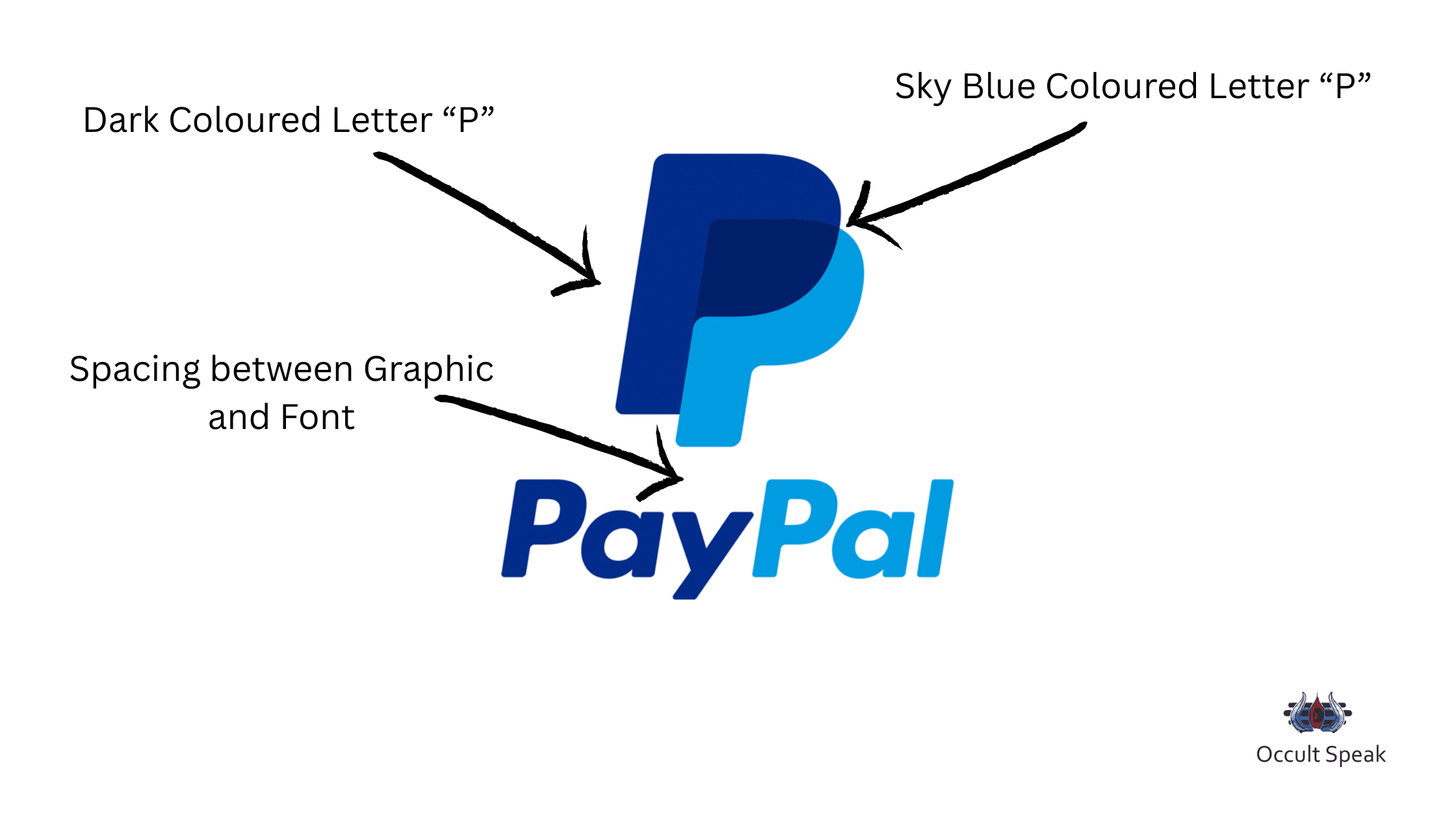
Dark Coloured Letter P : Show Maturity, fluidity of thoughts and and peaceful working environment but since here first letter overlapping on other P, the letter has dark coloured in Blue show high work pressure, they often keep changing their product line as per the market trend hence the new features would be added frequently to attract the customers.
The Light Sky Coloured Letter P : The sky blue colouration shows more of the information is given or knowledge is spread across the company or on social media. There would not be personal input from the management and the middle management would be loaded with lots of work and flowing of the information with tight deadlines.
Spacing between Graphic and Font : There is equal and proper spacing between the graphic and typography which seem there is good timely management among the Managers and Executives. Of course a few times there would be a tough time for the Executive to deliver the work in stipulated time period.
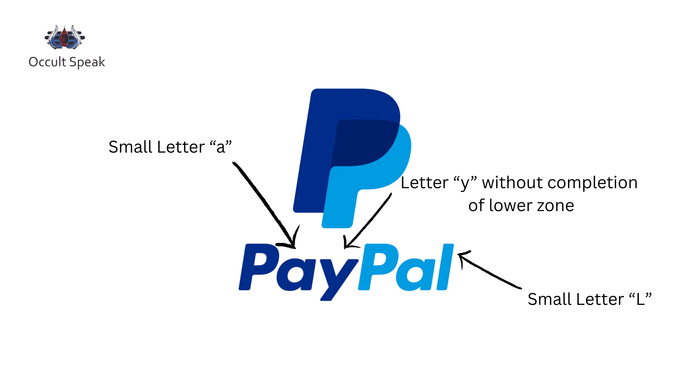
PayPal Logo
Angular smaller Letter “y” : This structure shows the company and management would work on technical aspects very often and would love to see if the product or project is feasible to launch or not. This letter also shows the execution part is often seen with only practicality and emotions it seems to be absent in the team.
Small Letter “a” : The proper structure of zero and one formation in Letter A is seen to make organizations work with proper planning, strategy creation and timely execution.
Small letter “l” : This retrace style structure shows that a company creates a product(s) in such a beautiful way that the consumer/vendor understands product features easily with its pros and cons. This also shows the clarity in their work structure.
Blue Colour with White Background : It shows they are flexible in their working pattern but due to some strong ethos and principles, the management and leaders are struck somewhere.
PayPal Logo
Design Simplicity and Versatility in PayPal Logo
The PayPal logo is made to be extremely adaptable, guaranteeing impact and clarity on a range of print and digital media.
Whether it is used on marketing materials, mobile apps, or websites, the minimalistic design approach guarantees that it will always be scalable.
The lack of superfluous decorations is in line with contemporary design principles that value legibility and simplicity.
Impact on Branding
PayPal’s brand identity is greatly influenced by its logo. Its color scheme, font, and monogram all work together to increase consumer confidence and brand awareness.
Users are drawn to the logo’s contemporary yet recognizable look, which supports PayPal’s position as a pioneer in online banking.
Conclusion: A Logo that Speaks Security & Innovation
An excellent illustration of how branding may influence consumer perception is the PayPal logo. Through the thoughtful application of color, typeface, and iconography, PayPal conveys efficiency, digital innovation, and trust.
The logo is still a potent symbol of safe and easy online transactions whether it is seen on a website, app, or payment gateway.
How do you feel about the design of PayPal’s logo? Tell us in the comments section below!
Your Digital Logo Analyst,
Leave a Reply