Vodafone Idea Logo: Recently Vodafone merged with Idea Cellular company to form an alliance known as Vodafone Idea Limited to sustain and beat their new rival Reliance Jio in the telecom industry.
Vodafone India which is led by British multinational telecommunication company has its registered office in Newbury, Berkshire, England and has its headquarter in London. It is the 4th ranking telecom company in the world, operating 24 countries.
Idea Cellular which is an Indian mobile telecom operator with its headquarter in Mumbai, and Gandhinagar, Gujarat- INDIA. It is led by the Aditya Birla group.
The entrance of Reliance Jio has compelled many telecom companies either to quit or to merge and acquire with other companies to sustain in the telecom industry.
On 31st August 2018 – these two telecom operators merged to form an alliance named as Vodafone Idea Limited. Here in the combined entity – Vodafone India holds a stake of 45.1 % and Idea Cellular holds a stake of 26 %.
Since the company is not getting a stable business even after 2 years, they are trying their best to acquire the customers based on either Reliance Jio or Airtel.
On 7th September 2020, Vodafone-Idea came up with a new brand identity named as “Vi” to showcase that these brands are now officially merged with one unified brand hence named themselves as VI.
Let’s analyse the Vodafone Idea Logo today, to know how these new unified branding will work or sustain in the telecom industry.
Vodafone Logo Analysis
Vodafone Logo – Vodafone India and group plc consists of a circular logo in red colour with comma symbol inside the circular structure.
Circular Structure – This round structure in the logo shows a good flow of money as there is no cutting of extension of any part either in the logo of Vodafone.
Red Colour – Through the parent logo of Vodafone it is in dark red colour which depicts the aggressive working structure and lots of enthusiasm and a desire and wants to grow in their niche.
White Colour – The white colour in the logo with comma shaped shows creativity and imagination. Thus the leaders and product management team would be competent enough to launch stunning products in telecom.
Fonts – The font of Vodafone is written in small letters to show that they are receptive by nature and accept the public views and feedback.
Such organizations always listen to their customers, no matter how far they have to move on, but they will take care of their own internal and external employees. Hence small letters as a font in logos show caring nature, believes in oneness and hence such organisations are customer-centric by nature.
Overall, Vodafone group pic Logo shows a good customer-centric organization who works on data compilation and taking proper action based on the current market scenario.
Now let us dive into Idea Cellular Logo Analysis before we move into VI -Vodafone Idea Logo Analysis.
Idea Logo Analysis
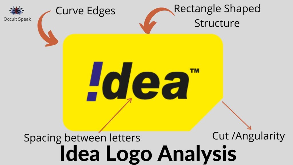
The idea logo itself depicts its industry and niche it is serving into. We can see the yellow chip sim card as a logo that shows that they want to serve and give complete gamut of telecom in a small packet hence in earlier days when they had launched the company, they were offering plans in 2G and 3G in postpaid at very cheaper rates.
Structure – The rectangular structure with a smooth curve in the 3 edges of the logo shows that they are planning to work on the market’s supply and demand chain, based on the current and past data. Still, they are unable to do so because the curve in the 3 sides of the logo makes them soft whereas there is a need to become harsh to take strict decisions and vice-versa.
Cut in the lower right side of the Logo – This cut in the right bottom shows there would be deduction in the services of their customer base, meaning initially they may have offered a lucrative service later may switch to those services to save their overhead expenses.
Font – The font in idea cellular logo also has the same small size which again repeats the same working pattern of Vodafone India which likes to serve the customer, based on their feedback and hence will launch the product(s)-line based on the current market scenario but looking for loyal customers.
Fiza wala “a” – The letter formation shows company stake owners and top management does not blindly believe in the verbal communication and want everything documented hence the written format is important for them.
Therefore, they won’t take any decision, based on assumptions or past beliefs. Rather they will work on research-based market data, analyse deeply and work on those ideas if it is possible to launch in the market.
These companies also make quick decisions in their tough time to prove that their decision is correct.
Colour Combination in Idea Logo
Colour – Logo design of Idea Cellular has Yellow colour which is colour of Jupiter in Astro-Numero Science hence they would like to spread their wings across the sky of telecom industry and absorb more revenue but they have failed in their mission to the market crises in last 3-4 years.
I-dot in Inverted Mode – The main focus and attraction of Idea Logo is their i-dotting in the inverted structure which itself shows that the company will plan and showcase their business with weird ideas and plans which was never seen in the market.
They take time and will do every activity in reversed form just to prove themselves the best. Since i-dotting in Graphology means the event and stem depicts the person itself (here stem in I letter show organization idea cellular) make their life vulnerable.
Overall, the Logo Design for idea cellular does make the enterprises stable for making their mark in Indian telecom industries.
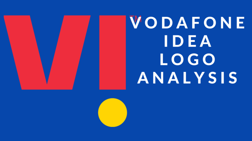
Vi Logo Analysis – Vodafone Idea Logo
Idea Vodafone Merger logo itself reflects many things like the future goal and past destruction.
The newly launched Vodafone Idea Logo is a letter-centric logo with a combination of two Letters’ Initials of Vodafone and Idea Cellular. They have taken the colour of their parent company red and yellow.
Structure of Vodafone Idea Logo
The letter-centric logo shows attention-seeking behaviour. The 2 initial letters are written in capital form which shows they will try to do anything to get the attention of the market.
In this new venture as Vodafone Idea Limited, there is no unified logo and each company had used the same logo which consisted of small letters in both the cases showing customer-centric behaviour wherein now both letters are sharp and capital showing immaturity and self-centred attitude.
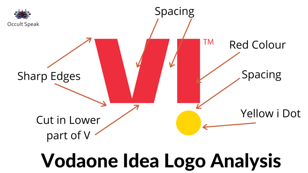
Sharp Edge in the Letters – The extremely sharp edge in letter V and I show a good analytical mindset and Management would like to go in-depth of every product and strategy hence there is a good chance that decision would be taken after considering many parameters.
Therefore, the advertising campaign, the promotion will be such that it will catch the eye of the public.
Such organizations need valid written feedback from their customers/vendors hence there are chances that they may start taking surveys and work upon fresh data.
Hence, the brand recall value is higher with a capital letter logo.
Cutting in Vodafone Idea Logo
Cutting of Letter V in Lower Zone – The letter V of Vodafone is made in such a way it seems it has been cut down from the bottom. Hence, there may be a high chance of stress and anxiety prevails in top management.
In Graphology, letter V is said to be and looked for Sharpness, Universal Truth, Acceptance, Data and Solutions. Here the lower part of V has cutting edges which is a bad sign of lots of difference of opinion among the leaders in the organization.
Although the base is made with a thick foundation,it shows – the enterprise wants to settle and make a stable business in the next few years but the shape and size of letter V does not make them successful in their endeavour. If the destiny allows them then maybe the company will beat their rival like Airtel and Jio.
I Dot ( Inverted ) – As told above, in the Idea Cellular Logo that I-dotting which should be always above the stem of the i as per the principle of graphology but idea cellular has before and after a merger has kept the same concept of I-dot moves in the lower zone show its deep desire to earn money at any cost.
This may lead to Vodafone Idea going to enter in unstructured management and they may launch the products line which is out of the box but connected with market trends.
This I dot is also Circular in shape hence all the data, memories (event of products and activities) of the organization will be preserved to showcase their achievement in the later years.
Colour in Vodafone Idea Logo
The main or primary colour we can see the vodafone idea logo is red and yellow. Hence Red which is said to be the colour of aggression and fast action, does not want to waste a single movement and will become opportunistic and will try to grasp the movement of the market before their rivals do.
Yellow colour in I dots show collection of data and dispersion of solution to the public by showcasing as the only solution in telecom industries and make them realise that they are pioneers in launching such services.
Yellow is also a colour of publicity, friendly in nature and open to ideas hence the company will keep it’s one door always open to looking for new or innovation in their products line.
Conclusion – The Company Vodafone Idea Limited new unified Brand “V i” will definitely grow in telecommunication but there would be big hurdles from their own manager/leaders.
The differences of opinion and rigid mindset may dissolve their vision to grow.
But the company will definitely grow and try its best to capture its previous customer base which is taken away by Reliance Jio and Airtel.
Let me know, how did you find this blog on “Vodafone Idea Limited Logo Analysis”
Digital Numerologist,
Nirav Hiingu


Leave a Reply