In my last blog on Vodafone Logo Analysis, I explained about how the new brand collaboration logo will work for Vodafone Idea Limited Co.
Today, I will discuss the logo of the fastest-growing news channel of India – Republic TV Logo Analysis.
Introduction to Republic TV
Republic TV Media Network is a media publication company Co-founded by Arnab Goswami and Rajeev Chandrasekhar, an Indian Politician, MP of the upper house (Rajya Sabha) since 2018 leading the team of Kerala Wing of Bhartiya Janta Party as Vice Chairman.
Earlier Arnab Goswami was the Editor-in-Chief with TIMES NOW and resigned from this position on 1st November 2016.
A few months later he started his own Media Channel named as Republic Media Network with 2 Brands named as Republic TV which is an English News Channel and Republic Bharat, the Hindi News Channel.
Since the death of Sushant Singh Rajput, Republic Bharat has come in the extreme limelight with its TRP and viewership increased up to 22 % showing its aggressive working structure.
Republic TV has been one of the most followed channels for the last six months of the locked-down period, by highlighting and blaming Shiv-Sena NCP and Congress alliance Uddhav Government.
Hence, being a Logo Analyst, I thought of analysing the logo of Republic TV deeply as to why this news channel is so much aggressive in its working style and has extreme sarcastic commentary in all its news shows.Let us analyse Republic TV Logo.
The Structure of Republic TV Logo
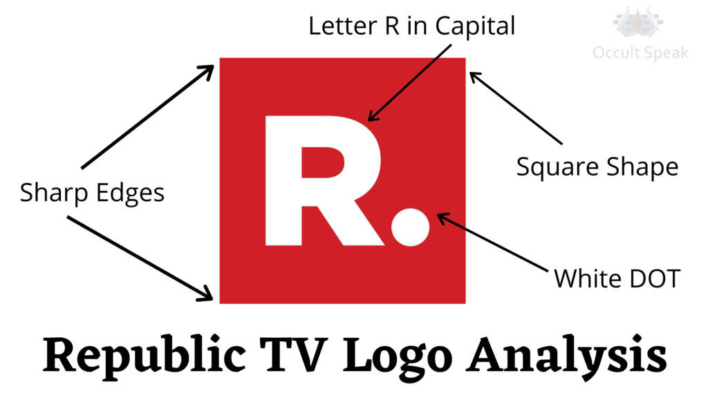
Square Shaped Logo– The square-shaped logo always shows the cutting edge technological advancement.
This shape also gives more stability to the organization and its Co-Founder. Hence, we all know how Republic Media Network and its sister concern – Republic Bharat has grown its TRP in the last 1 year.
The square shaped logo also depicts slow but steady growth to the company hence we can see the growth rate and success rate of Republic TV is increasing day by day .
Further, we can also see organizations with a square-rectangular shaped logo, work on specific rules and regulations. They will never go for unethical practices to generate revenue.
Square shaped Logo shows that the company creates proper shape and structure in which they go into too much in-depth analysis of every single project. Hence we can see how SSR- Sushant Singh Rajput case provoked by Arnab‘s Republic Bharat stating that SSR hasn’t killed himself but he was killed by an unknown source.
P.S -I have already mentioned about the same in my blog posted on June 22nd through Palmistry that Sushant Singh Rajput didn’t die due to depression or suicide.
One can view my blog article on Sushant Singh Rajput
Dot in Republic TV Logo
We can see the prominent dot formation with white colour in the logo of both Media Network and Republic Bharat which shows the company is very focused in its goals/vision. Such an organization has a clarity of thoughts about what and how to move ahead with the current trend and the demand of the market.
Hence, we know how the Republic TV is going on with the flow of current crisis whether it is Covid-19, Lok Sabha Elections, movement or any reformation made by Narendra Modi Government or Sushant Singh Rajput Case, this organization is way ahead of the new rival channels.

Placement of Dot in Republic TV Logo
We can see the placement of this white coloured DOT is on the right side in lower zone hence as per the Graphology Rule, right side stand for the future and the lower part stand for the material drive, sex, money, name and fame.
We can see this media channel is working super fast to cover every single news which happens in any corner of the nation and they are also extremely fast in broadcasting their latest news which is due to the DOT placement on the lower right side of the logo.
Edges in the Rectangular Shape of Republic TV Logo
We can see the sharp edges in the logo depict how sharp-minded people have been recruited in this media channel to grasp the opportunity and move with the fast trending news.
The Edges also depict the extremely hard working and shrewd attitude toward the rivals and those people who do not agree with their opinion.
The Edges show extreme alertness and proactiveness during the crisis, we can see that even after getting lots of criticism and issues, Arnab Goswami and its team are always high on energy and determined in their mission to deliver the original news.
Edges with proper structure and shape show a firm determination against all the odds.
The Font in Republic TV Logo
The Capital Letter R which is the initials of Republic Media show itself their high self-esteem and ego which can’t be crushed by any individual or community or political parties.
R: In Graphology, this letter stands for Rest, Relaxation, Recreation and Relationship. Therefore the company will have a good rapport with current government, vendors, suppliers and its end consumers.
The Dot before the letter R shows awareness of the surrounding which makes the Core team of Republic Network very sceptical on every activity of the society.
Colour Combination in Republic TV Logo
Red Colour – The Planet Mars which is known as Mangal Devta in Eastern Astrology which is said to be Defence Head of the State. The colour of this planet is RED which means it has a stronghold on its activities and they are very shrewd and quick in their action which is already seen in the company.
Mars does not give up easily hence people coming under the influence of this planet or its colour do not give up nor rest until the project is completed.
Red is also the colour of motivation, action, high enthusiasm and leadership, therefore company republic will keep a strong footprint in the journalism and media industry.
White Colour – This colour depicts the mind and planet moon in eastern astrology and numerology.
Colour Psychology also says, people, using this colour always keep their mind cool and calm. They are good at planning, strategies-making and also well-balanced in their work and personal life.
The Yin energy in this colour shows people working under this colour get emotionally affected by the positive or negative aspect of society.
They get severely affected and stimulated even with slight changes in current work affairs. We have seen Republic Bharat with proper planning and implementing their plan on time.
Republic Bharat TV Logo Analysis
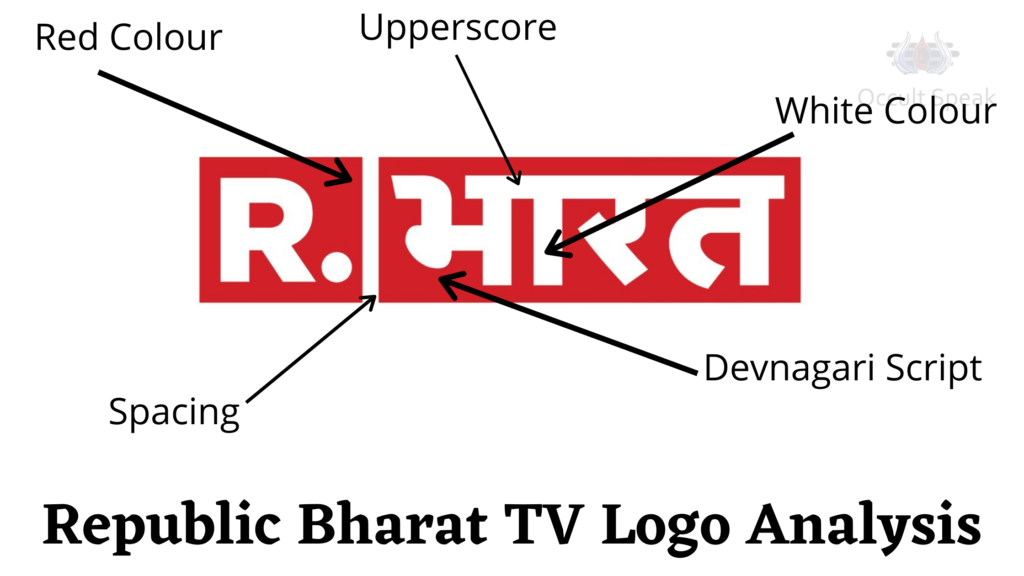
The Logo analysis of republic Bharat tv is the same as its having same structure and colour combination except the Hindi Devnagari Font having a complete upper score in the word BHARAT – भारत show organization will be working as per the proper planning and work under the extreme pressure, therefore, people working in Republic Bharat TV would have a tough time as they have to flexible in timing and work under immense work pressure.
The complete upper score logo in Devanagari script shows that the person/organization wants to work under strong ethos and rules and regulation and does move beyond its limitations.
Two-Block In Republic Bharat TV Logo
We can see in Bharat TV logo, in the first half the same replica of Republic TV is fitted whereas the second half of logo consists of a rectangular block with Hindi script as BHARAT in big font size shows a good channel in show business and wants a layer of attraction from the society.
We have seen the marketing and string operation of Republic Bharat TV are always eye-catching and get a quick reaction from their audience that itself shows Bharat TV is always covering the position of the leaders in the Hindi news channel in India and abroad as well.
The Size of this 2 block logo also shows there is a small team working with extreme good coordination and deadline.
This structure is known as Segmentation Logo in logo analysis wherein organization has an effective team which is small in size but works extremely well but sometimes there comes small issues in coordinating with others team members and they hide many facts and figures from other departments such HR, Operation, Sales, Tech etc.
Conclusion: I can say, overall this company Republic Media Network’s – Republic TV and Republic Bharat (भारत) TV will come with great enthusiasm and nobody will stop them to grow their channel in the Media Industry.
Let me know, how did you find this blog on Republic Bharat TV Logo Analysis?
Logo Analyst,
Nirav Hiingu



Brijesh
Very well written & explained Nirav Bhai..!!