Today we will talk more about the medical and diagnostic industry. When it comes to the diagnostic industry, one name immediately pops up in mind – that is Dr Lal Path Lab, one of the leading diagnostics companies in India.
Dr Lal Path lab has a qualified team of 147 pathology specialists with eight radiologists, 13 microbiologists, five biochemists, and 11 specialists with Doctorate. In addition, the company has 3000 centres with 55 percent of the staff in laboratory and operation functions.
Today’s article is about Dr Lal pathology laboratory’s logo analysis.
The organization is headed by its Chairman brigadier Dr Arvind Lal and nine members such as Dr Omprakash Manchanda (Managing Director) and Dr Vandana Lal (Executive director) has given massive growth of around 50%.
The growth rate year 2020, a tremendous growth rate company which is now growing in healthcare and diagnostic centres with an expansion of its wings across the different states of the nation.
Let’s dive into the Dr Lal Pathology Laboratory logo design and Analysis.
I have published the logo design analysis of State Bank of India and Apple Inc.
Kindly check out the link on Bada-Business Logo.
The Shape and Structure of the Dr Lal Path Lab Logo
We can see that the organization has a rectangular form which shows that the company is well established, and it has left a fantastic footprint on a different state of the country.
The sharp edges on the four sides of the rectangle show that the company has very keen observation, and the top management always keeps on going into the in-depth of every aspect of the product and services.
The company always creates intense and long-term strategies for each product they launch in the Healthcare and Diagnostic Centre.
The sharp edges show that there are solid fundamentals that prevail in the company. Whether it is a sales marketing Corporation, HRM, Technology, Research or Advertising campaign, the company likes to work systematically and always tries to deliver the best quality services to end customer(s).
The shadow in the rectangular shape in Dr Lal Path Lab Logo
We can see a very Shadow formation in the logo design of Dr Lal Path Lab.
This shadow depicts the company has decisive leadership, and it always reflects its strong ethos, due to which it is known as the fastest-growing company in India with an average growth rate of 10-16 %.
The Shape of the Molecule in Dr Lal Path Lab Logo Design
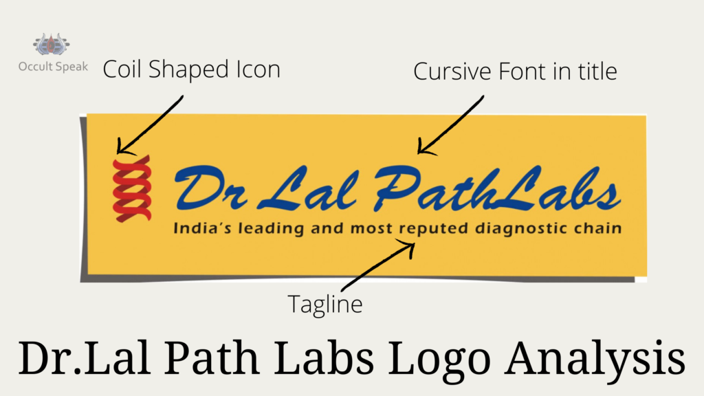
The coil-shaped atoms and molecules icon in the graphics of the ‘Dr Lal Path Lab’ Logo shows that they have an extremely logical, scientific, and constructive mindset, and they believe in practical and realistic goals.
Thus these approaches and the work structure of the organization help them to set their achievable goal.
The coil is moving in the upward direction. The company has to work aggressively 24/7,365 days to achieve a realistic goal, and there would be a lot of work pressure and extreme stress in the middle and lower management team.
Cursive letter in the FONT of Dr Lal Path Lab
The garland formation in the Logo itself says the company has a logical and constructive mindset.
There is a high chance the company will grow its wings in the international region.
In such a type of company, the management works more on statistical logic and less on emotions.
The company never tries to compromise on quality.
They always look forward to giving the best services even if they fail to achieve the profitable margin In business.
The cursive font also shows the company extracting lots of data from the different sources to gain realistic figures and get market values and industry insight.
Although the company, Dr Lal Path Lab works more on logic and reasoning, they also take care of the employees, making for a friendly work culture.
So, we can say the company is both -Profit oriented as well as employee-friendly.
The Fundamental of Logo Designing says that such companies have a low attrition rate and robust Growth even in recession time.
We have observed that we are the 2nd Wave of Covid-19 in India, few companies get big success in their business, and Dr Lal path lab is among the top growing business ventures in India.
Cursive Handwriting in Dr Lal Path Lab
The cursive handwriting in the Logo shows that the company is very constructive by mindset, and it can also take lots of data for the Analysis for future reference.
B Slant in Logo – B Slant in the Logo of Dr Lal Path Lab show, the company is too expressive, conveying its message to the vendor’s supplier and the end consumer.
This is a perfect time that the company can connect with every aspect of the customer’s issues, and therefore the company is growing multifold within a concise period.
Letter in FONT in Dr Lal Path Lab
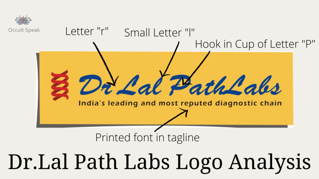
R in Logo – the letter on knotting in the initial step of small letter “r” which shows, the company sometimes hesitate to express its views to this internal customers i.e. employees and many time due to this cursive font, the company hide many facts and figure from its management and executives.
Loop in Letter L
The circle in the letter L which shows the company has enough sensitivity and always shows the concern for its employee and vendors, but sometimes this time we also had to face very harsh criticism from the media and the rival company.
Thus, the company can handle, protect itself from negative statements, and make a good PR in the Healthcare industry.
Capital letter P with hook
We can see in letter P that there is a hump moving on clockwise and again going inside the Cop of the letter P, which shows there would be some issues twitter top management that cannot recognise and unable to resolve.
This Hook in Cup of “P” seems like a Dragger in the stomach. Medical Graphologists say such a Dragger creates havoc and later leads to Gastro-Intestinal Issues in the Lower Abdomen.
T letter in Logo
T Letter is having a suitable crossbar in the middle of the Logo which shows the company has a realistic and achievable vision and Mission and therefore they can do the proper branding and growing its business in a term of satisfaction, success, and stability of the company in the Diagnostic industry.
Joint Letter in H and L in Dr Lal Path Lab Font
There is some thought process of making a joint venture or merge with some of the rival company, or maybe the company is thinking of acquiring some of the firms to grow its business and cut off the competition.
The Graphology Rules says when there is stem sharing or 2 letters sharing the same stem, it shows a dilemma as the person cannot move out of the interrelationship and personal zone.
Letter B in Logo
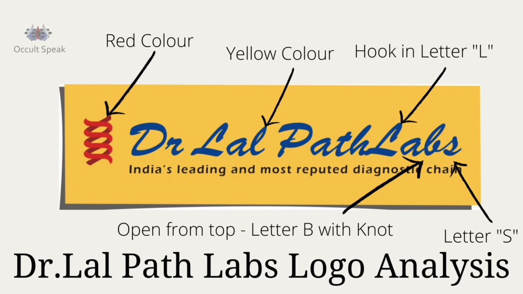
The letter B opened from the upper side makes the company vulnerable and shows the company is still not satisfied with the current Growth and revenue.
They feel they need to make more profits from the existing market. So quite possibly Dr Lal Path Lab wants to open its branches overseas.
Letter S in Logo
Download section of the letter S and cutoff in starting stroke, which shows then maybe harsh communication and sympathy level may go down.
Tagline and Letter “Fiza wala A” –
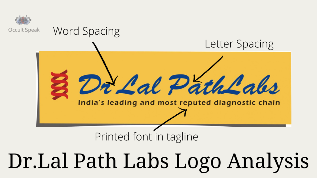
The whole slogan is well written with black font and with proper spacing in letters and words.
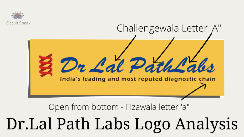
“Letter A” in slogan which is fizawala “a,” which depicts a company that does not believe in verbal communication.
There are trust issues, and always want to write proof and documentation. Plus, company data, internal communication, wealth, and money are leaked ( look at the bottom of the letter a is broken ).
This shows there are high chances of leakage and damages to the reputation of the company.
The company needs to improve its structure with its logo design.
Colours in Logo
Yellow Colour in Logo
Yellow colour shows the company is incubating lots of data and information from different sources and trying to restructure its operation and product quality and later give the best services and information to its end consumers.
Yellow is the colour of Jupiter, and since it, a Leader and strong qualities of a Minister, the company itself pose itself as Industry Leader and Pioneer as the best quality path lab in India which is also seen in its tagline.
Red Colour in Graphical Icon as Coil
Show aggressive research team which focus on giving the results in the stipulated time.
Since the company has a dedicated team of 147 Specialists this itself shows how this company is merging as the Industry leader in the Diagnostic Industry and will excel in its field.
Blue Colour in Font
Show the calm and cool attitude of the Top Management, and there is a sense of security, trust, and uniqueness built among the audience customer of the company.
This Colour gives an assurance that the company won’t give up on quality and they are always present in their ( customer- ailment) crucial time.
This assurance, trust is built with amazing PR and Branding done by their Agency.
Conclusion – Overall this company -Dr Lal Path Lab is a great company to work with and has stood out as the Best Quality Oriented Businesses. I wish them all the best for their Future Endeavors.
Regards,
Nirav Hiingu
Logo Analyst.


nikhil
wow