Flipkart Logo Analysis – Walmart India Logo Analysis
What is a Business Logo?
The creation of a logo for a business demands vision, identity, creativity and a thorough
understanding of customers, supply, market. It also significantly delivers the message about the image and the business to the target audience.
A business logo is a visual mark that represents a business that further becomes recognised as the Brand.
It can help customers, suppliers, vendors to identify and remember the brand which distinguishes it from the competitors/rivals.
A company logo is the cornerstone of its image. The first impression is the lasting impression of a company/brand. It is the first thing which people look at and create an impression either positive or negative.
Why is a Business Logo required?
A Logo is a Visual Representation of any company or organization which forms an identity of the business foundation.
It is a symbol, monogram, emblem, trademark or another graphic representative of your corporate firm. It is only those signs or special marks which distinguish and recall brand value.
We should also note that merely creating a logo will not create a great company. It is the vision, integrity and a great mind that creates a great product or brand.
Let’s analyse a few corporate Business Logo of Flipkart which is also known to few as Walmart india to get insight into scientific logo analysis:
Flipkart: Flipkart Internet Private Limited is an e-commerce company based in Bengaluru, India.
Founded by Sachin Bansal and Binny Bansal in 2007, the company initially focused on book sales before expanding into other product categories such as consumer electronics, fashion, and lifestyle products.
They became the aggravator, a platform for selling all the stuff ranging from household to commercial products.
Flipkart was acquired in 2018 by US Retail Giant Walmart ( Walmart India ) with 77 % of the stake, controlling complete Flipkart for US Dollar 16 Billion.
Flipkart Old – Before the Acquisition by Walmart
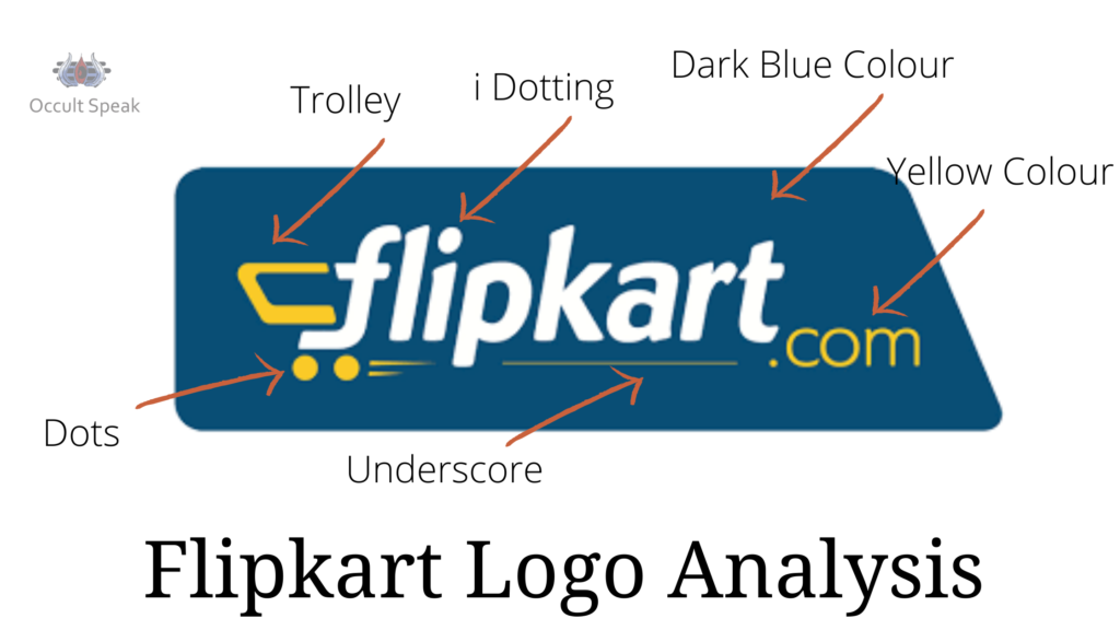
The shape of the Flipkart logo ( Now Walmart India) :
It had a rectangular shape with a dark background of blue colour.
This rectangular shape gives stable growth to the company that the founder members and stakeholders always looked for the company with a practical approach and portrays a realistic picture.
The background colour flipkart logo ( Now Walmart India) :
The Dark Blue colour in the background shows faster execution to reach the desired goal. But owing to the dark shade – the operation takes some time to complete the work. The company also wanted to keep expanding its wing in different regions and categories, visible in their past activities.
Underscore : (line below the word)
Flipkart.com ( Now Walmart India) has shown great confidence and a deep desire to create a billion-dollar company. This line also indicates its stability and detail orientation.
Small Letter: The logo starting with Letter f depicts an urge to become a user-friendly and eco-friendly company. The company was doing many activities to create bonding with the external customer (end-user) and internal customer (employee).
Trolly in Letter f: This trolly indicates that the company does not wait for a period to grow and keeps looking for opportunities.
When the US Retail Giant approached for a merger, Flipkart ( Now Walmart India) merged with this retail company. Trolley also depicts fast movement that did not stop at all.
The acquisition of this company is not a piece of news, at least for a Logo Analyst.
Colour Yellow: Yellow is the colour of knowledge and wisdom. This colour scheme shows that the company goes deeper into the market research to know the demand and supply of the latest trends.
White: It is a colour of calmness and soothing effect. Flipkart takes all the decisions with extreme care while executing its brand launch. They are very cautious about funding and branding part-projects as per the requirement, keeping in mind the unnecessary expenditure.
Conclusion: Overall, flipkart.com will grow with its footprint in different states of the nation – INDIA and feels its presence in the e-commerce segment.
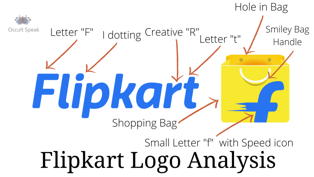
Flipkart New Logo ( Now Walmart India) :
After the US Giant Walmart – New Management changes its Brand Logo with a completely new look and brand positioning.
Shape: The Shape is of Bag in a square-shaped logo which shows its strategies are as per the requirement.
The Bag seems lighter in weight which means that the company executives would not wait for the new resources to come/acquire and play in e-commerce.
They will immediately move on, as per the competition from a rival like Amazon India.
Font in Flipkart ( Now Walmart India) :
It is a single letter “f’” formation with navy blue colour and sharpness in the back portion of the letter which the speed and faster execution plus letter f show – the females’ employee will be taken extra care of and will be given enough authority for planning- strategies and quicker decision making.
Management would be soft with the employee when it needs to be strict and vice versa.
Hole in Bag Handle in Flipkart Logo ( Now Walmart India) :
The white colour makes the Back End strong enough to handle the last movement actions and takes all the to complete the projects on time.
Smiley in Flipkart Logo ( Now Walmart India):
If we look at the new logo minutely, the smiley shape seen in the New Flipkart Logo shows that the company is taking extreme care of the Backend activities. Technical aspects and the employees.
Conclusion:
Since the company kept re-investing in branding, there are chances that the company grows multiple times compared to the rival – Amazon brand. Also, the company may further merge or acquire it by another Giant Company.
Walmart: An American Multinational retail corporation that operates a chain of hypermarkets, discount department stores, and grocery stores, headquartered in Bentonville, Arkansas.
The company was founded by Sam Walton in 1962 and incorporated on October 31, 1969
Shape in Walmart India:
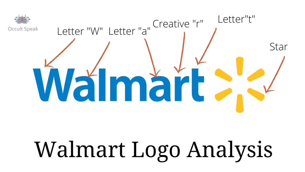
Walmart has a word-centric logo. That means that it is good at collecting a lot of information, data and excellent at customer acquisition.
Circular Star Mark in Walmart India :
The star mark on the right side of the logo resembles a shining star. The company has good positioning as a brand leader in offline marketing. Also, it would give a personal touch to the end-user, the customers.
This circular star mark also depicts the perfection in their professional zone that this company would be going into the detailed analysis and launching of the product at a perfect time, matching the requirement of the market.
The only drawback of the Shining Star will be aggressiveness in the box zone. It will be created by the frustration and stress levels of many internal employees while working on brand new products.
Colour combination in Walmart India Logo :
The word-centric logo of Walmart in blue colour shows the deep data for expansion of the business. There is no curvature and smoothness in each letter which shows the company will always take care of the minute details such as offers, discounts, sales etc.
Letter ‘a’ in Walmart India :
The letter A in Walmart is the Fiza style ‘a’ it shows that the top management would not agree on any and every project. The written communication and the approval from the senior management will always need a hard copy proof based on the latest Research and statistics.
Letter T in Walmart India Logo :
Letter T in the word Walmart shows the practicality of the ego and the high image of the company where-in the companies like to retain themselves as a Premium Services Provider platform for offline marketing.
Conclusion:
Walmart would be able to retain its position as a market leader in the offline retail market, not only in the USA market but also in the other parts of the world such as Asian countries like India and be a Pioneer in launching the best quality products for the end consumer.
Let me know, how did you find this blog on Logo Analysis on Walmart India?
Regards,


Leave a Reply