

Overview of the Tata Logo of Tata Group is a well-known brand worldwide not only in the automobile sector but also having a huge presence globally in other sectors.
Last Month that is in May 2024, i have published blog – Logo Design Analysis of ECI ( Election Commission of India )
This TATA Group was established in 1945, Tata Motors and other subsidiaries have achieved notable advancements in automobile technology, FMCG, and Consumers, with innovation, and design. The logo is a crucial component of its identity and has changed throughout the years to represent the brand’s goals and beliefs.
Early History of Tata Logo: 1945 – 1988
The original Tata logo, which debuted in 1945, had a red “T” enclosed in a circle. This design served as a symbol of the brand’s diverse interests and engineering prowess.
The color red represents qualities associated with the Tata brand: trustworthiness, honesty, and dependability.
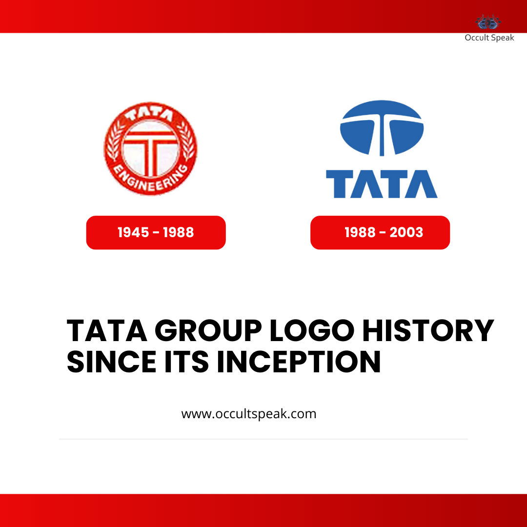
Tata Logo Redesign by Wolff Olins: 1988 – 2003
1988 saw a major revamp of the logo by the British branding agency Wolff Olins. The new logo included a stylized “T” formed by two white lines and a solid blue oval.
This design showcased the dependability, loyalty, and prosperity of the company. A three-dimensional metallic-gray variant was utilized while placing it on cars, emphasizing its sleek and futuristic appearance.
Modern Era: Tata Logo 2003 – Present
The 2003 launch of the current logo represents a further development of the earlier design. It has a wordmark beneath the symbol, rendered in a classic sans-serif Helvetica typeface.
The symbol represents fluidity and movement, presenting Tata as a forward-thinking and progressive business. The blue hue of the emblem still stands for strength, dependability, and excellence.
Tata First Logo design in 1945
Potential Future Design 2025 of Tata Logo
2025 Tata unveiled a minimalist concept for its upcoming logo in 2023. The new design is a stylized “T” made of two mirrored components, applied in plain black or white.
This logo represents Tata’s dedication to modernity and the emphasis on a tidy, stylish look. Notably, the new design emphasizes elegance and simplicity by leaving out all lettering.
Now Let’s drive into Design Aspects, Symbolism and Graphological Analysis of Tata Logo Design.
Symbolism and Design Impact of New Tata Logo Design
The Tata logo represents the values and goals of the brand and is more than just a visual representation of it.
The sleek lines of the “T” represent fluidity, adaptability, and creativity, while the blue colour of the logo stands for quality and dependability.
The logo is made to appeal to a worldwide audience, showcasing Tata’s enormous global reach and dedication to excellence and advancement.
Tata Logo From 1988
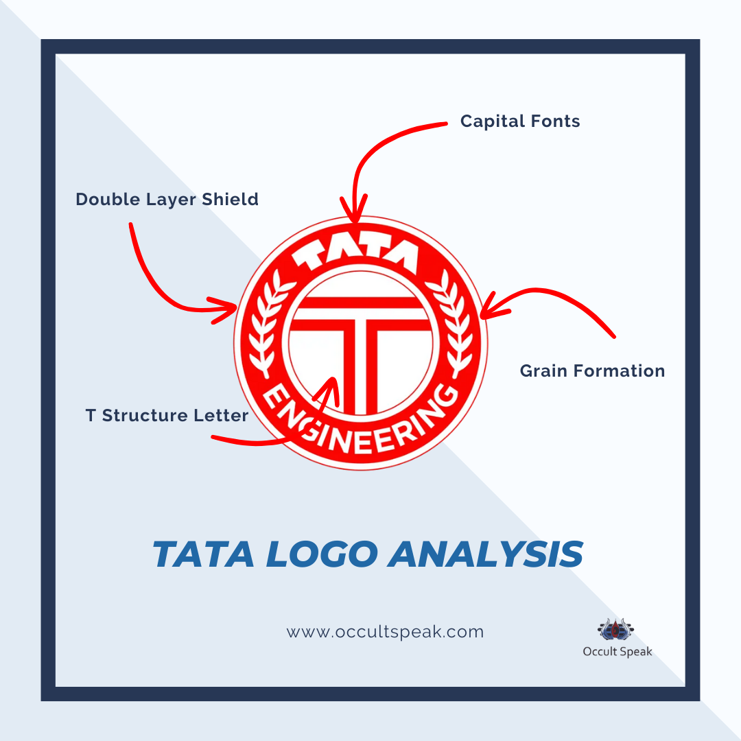
Tata Logo Analysis 1945 – 1988
Tata Logo from 1945 to 1988 showed amazing artwork with a red T letter inserted in the double layer circular ring to secure the organization with a lot of unnecessary hurdles and external disturbances.
The company Tata wants non-interference from the outer environment hence sub-consciously the ring is drawn in the inception logo.
Tata as usual using its signature mark of A Capital letter without a stroke bar in the middle bar shows lots of fear in delegating the power and authority to their people.
The Caplock Letter in an oval structure within a circle as Tata Engineering shows a high urge to grow.
This thought process, in turn, gives deep research and innovation plus attention-grabbing products in the market. Thus TATA has already proven its work ethics and innovative products since 1945.
Grain Formation in the ring is connected to its root and soil, there is an urge to stay connected with the Indian people and want to render the best quality to the consumer.
We know how Tata has been a pioneer not only in serving India whether it is product or service selling but also their philanthropic view towards growing and strengthening the nation with unconditional help.
Tata Motors Logo Design in 2003
Tata has been doing CSR activities and charity more than any other BIG Unicorn or Giant Corporation in India.
Circular Structure Tata Logo shows good cash flow and continuous workflow ( doing quality work / unconditional karma)
White Colour in the background with Dark red Color as a primary color in the Logo shows lots of Aggressive working structure and ego factors, both in management and staff. Also, such companies have a higher urge to maintain their status quo and dignity and stick to the current market trends.
Reasons why few companies use red as it is the highest vibrational color – look at Coca-Cola, Pepsi, Colgate, and Pizza Hut Logo, their marketing and PR Ads are quite aggressive and spend a thrifty amount of money in marketing their products to look best among the rivals.
Tata Logo Design in 1945
Tata Logo Analysis 1988 – 2003
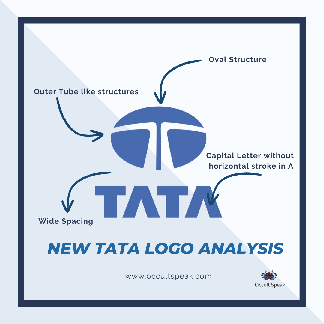
The new logo included a stylized “T” formed by two white lines and a solid blue oval. On the Design aspect, it looks sleek and highly creative no doubt the imagination and design are up to the mark but when I look at the logo designing principle and graphologically there seem to be multiple loopholes.
The Capital T cut divided which makes a mirror reflection also shows clarity and deep thought process on every single product they create.
Have a look at the Structure of the overall Logo, which is an AIR element that makes management restless and keeps working 24X7 until the goal and vision are achieved.
Thus there would be stress and anxiety to achieve their target.
Spacing between the TATA Font and Graphic is quite a wide distance, making time management an issue in the organization.
Sky Blue Color Caps Lock Font with equal distance in each letter shows deep insight and seeks equal opportunity in the market.
Such companies keep taking feedback from consumers and restructure and re-launch the campaign based on the output received from end customers, this is the main reason for the success of Global Indian Conglomerate TATA.
Blue Color as the primary color shows the self-sufficient, trustworthy and effective work style of TATA’s.
Outer Tube-like structures in the T letter on both sides show leakage of data and resources within the organization. Even the absence of the Stroke Bar in Letter A of Tata shows uneasiness, trust issues and a lack of proper legal heirs to the great TATA son.
We all know after Ratan Tata Sir, there is not a single efficient leader who can handle this great legacy of India.
Tata Logo Design 1988 to Present
Tata Motors Logo Analysis 2003 – now
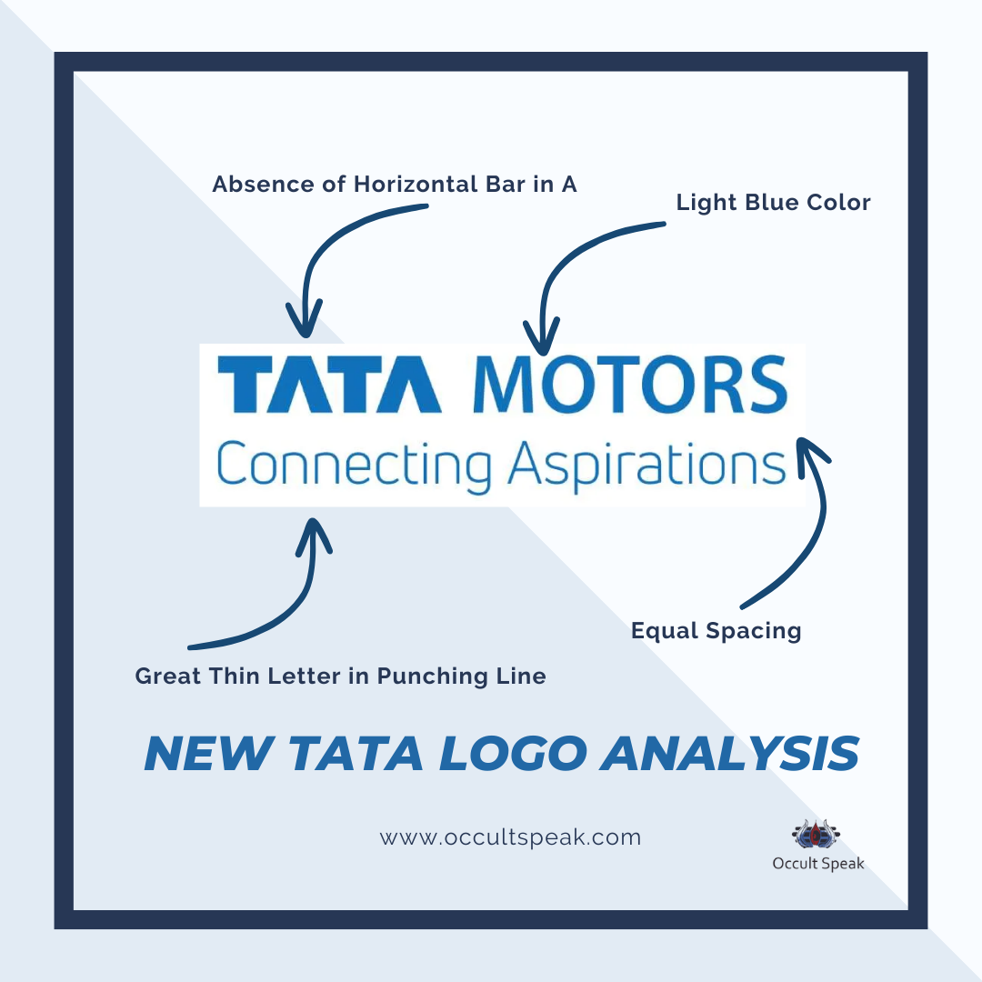
Beneath the symbol, in the same shade of blue, is the wordmark, which is composed of the classic sans-serif Helvetica font. There are no horizontal bars on any letter “A.”
The Tata Motor Logo has a good equal amount of spacing to show good time management plus the proper utility of Dark and Light shade Blue colours in TATA and Motor words.
The Tata logo represents fluidity and mobility. It presents the brand as progressive and visionary.
Tata Motors Logo Design
Summary
In summary, The transformation of the Tata Logo symbolizes the brand’s development from a multifaceted industrial behemoth to a contemporary, internationally renowned organization. It represents Tata’s dedication to innovation, quality, and dependability.
Tata’s emblem, which symbolizes the conglomerate’s historical past and future objectives, continues to be a potent beacon of trust and progress as it continues to spread its influence across the globe.
This article offers a thorough analysis of the Tata Logo charting its development and illuminating its design’s meaning.
Love & Light,
Nirav Hiingu
Logo Design Analyst
Leave a Reply