Think School Logo Analysis : Since 2017, I have published several blogs on different topics including logo analysis of top brands like Flipkart, Republic Bharat and my last blog was on Dr.Lal Path Lab. I have tried my best to explain how brand logos can help businesses to know its strengths and weaknesses.
To continue with the self-education series, I hereby present you Logo Analysis of Top notch Youtube Channel in Education ( Business Case Studies Channel ) in India, named as “Think School”.
Let me give you a short introduction to “Think School”.
What is Think School ?
Think School is an education revolution company – a mastermind by 2 brilliant Engineers hailing from Pune, India who were not satisfied with the current traditional education system specially on business segment.
Although we have the best B-Schools across the nation like IIM’s , JBIMS, Welingkar to name a few, still these B-Schools won’t give that insight on Business as they are taught in the classroom.
Although these B-Schools do have industry experts who come to their School and give their valuable insight on business and industry, I and Ganesh think that is not fair enough for the business community.
Hence, to break the ice, Ganesh Prasad who is Co-Founder and Chief Operating Officer along with his colleague, another education rebel Parsh Kothari who is the Chief Executive Officer at Think school, works on business education system, to provide best real life case studies to the business community via Youtube.
These deep thinkers analyzed the market and started a company named “Think School” with the same brand name on youtube to provide amazing case studies which are extremely helpful for Business Students. Below is the link for their youtube channel-
Link – https://youtube.com/c/thinkschool
You can enroll for their communication course, linkedin course and other stuff on their site.
Now, let’s peep into the logo analysis of this next unicorn of India – Think School.

Shape of the Logo – Think School
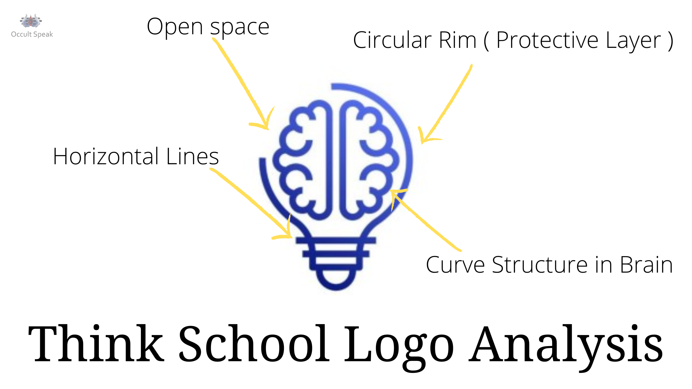
We can see the structure or shape of brand logo is depicted in Bulb form which is semi-circular shaped showing there is regular flow of energies ( now that energies we can say in the form of cash, manpower, information etc.) hence the company does not want to stop its growth and thus they are busy with continuous flow of dispersion of business information to their audience, needless to give any introduction.
Left Structure in upper brand logo
Next, if we look into the logo further, there is no complete circular movement shape in the brand logo of this company so does that mean there will be distortion in the company?
No, the brand logo has its unique identity hence – the upper left side is open which means the company founders are receptive to other people’s views and accept opinions.
Although after analyzing, founding team members take their own decision based on the feedback taken from the market.
As we all know, the left side of the human brain is always connected and governs the right side of the body and vice-versa.
Hence, the left side of the brand logo says that they work more on logic and practical aspects, they won’t take any emotions driven decisions.

The Horizontal Line Structure at the Base
Those horizontal lines in the brand logo make the base stronger hence, we can say that foundation of the company is based on logic and practicality as well as the emotions – seeing the curvature of the base having semicircular shape at the end.
Note : the straight sharp line always show the sharpness of the team or company.
The Brain Shape/Structure in Think School Logo
We can see the complete brain structure depicting human emotions is connected with the company. Hence, the founder members understand the human core values and also know the psychology behind the business world, which makes them understand the pain point of the business community.
The Curvature in the brain structure also says, there is a good flow of thoughts and ideas which give amazing communication skills to their audience. Thus, we can see this company owner also launches its own communication course and is able to deliver the output as per the demand of the customer.
These curved lines show the strong urge of learning which makes them goes deeper into every case studies and gives damn clarity about hidden information of business which aren’t present on Google and other sites.The Curve lines show mother programming which help them to have good clarity and strong vision of the company.

Color Combination of Logo in think school
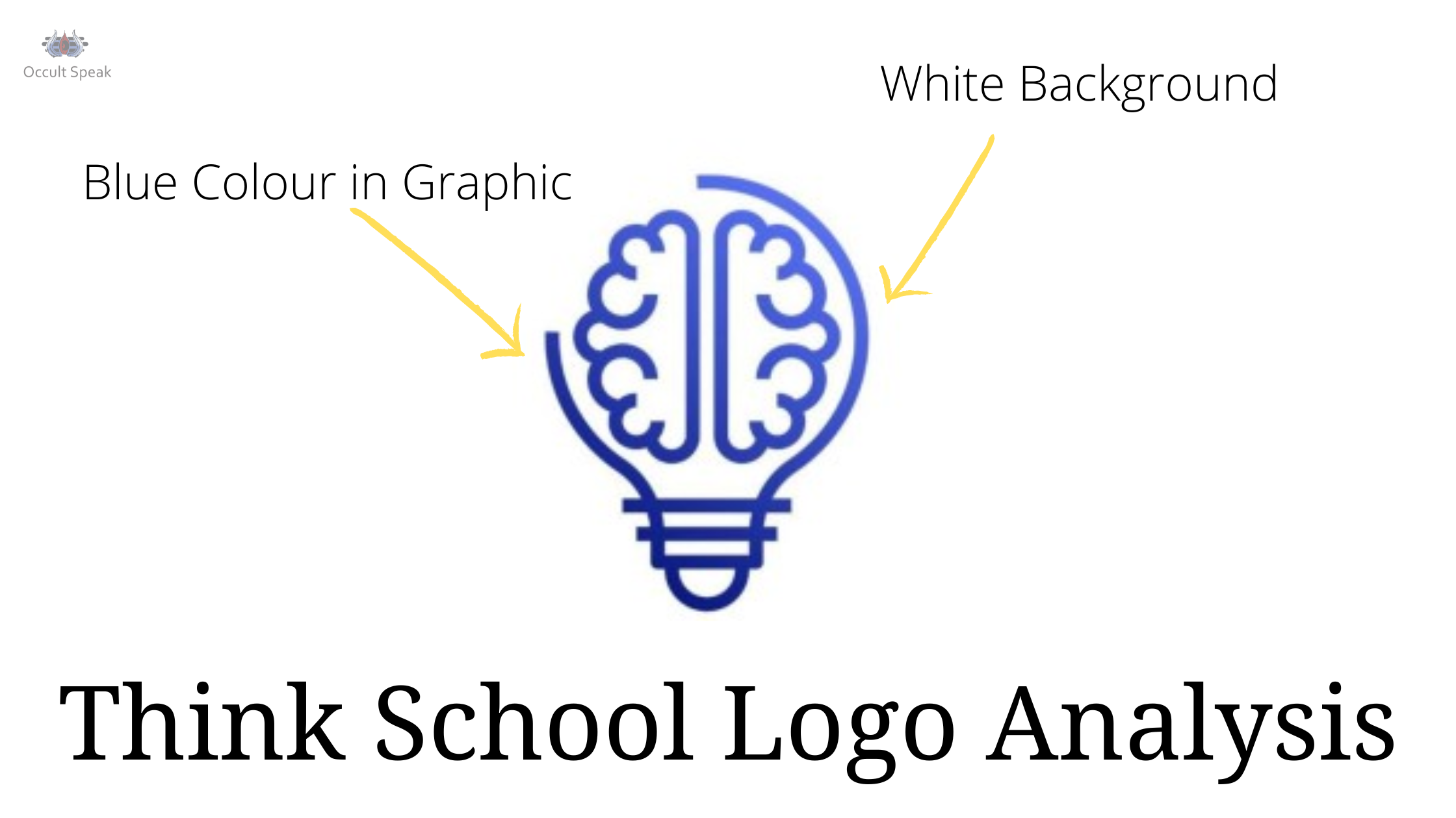
‘Think School’ has color combination of white and blue with shade of pastel and light shade which have a soothing effect on the human mind.
Blue Color in Think School Brand Logo
Whenever we see the blue color it depicts trust and reliability. Hence, the company shows that they are clear and have lots of transparency and looking further for expansion of the business in the same or different verticals.
The blue colors show a sense of responsibilities , productive zone time, one-ness/ unity feeling in the team as well in the business world. We can see many companies keep sky blue in their brand logo eg. Facebook, Reliance Jio, Twitter, Team India Jersey, to name few.
White Color in Think School Brand Logo
The white color always seems connected with the mind and gives a calm effect to its audience. In ‘think school’, the background of off-white gives a calming and peaceful effect in the minds of people.
This color also shows the person/company will take some time on imagination level to think, recreate the product with some extra information which will connect its audience to the products or product line.
White is also the color of bonding and relationship hence the company always tries to give its quality product and always wants to retain its relationship with its business class people, no matter what level of outcome or business their vendor/client are providing to them.
For the brand ‘Think school’, the customer is always the King and thus they treat their vendors and clients at top priority.
White color also shows good planning and strategy maker. These show another quality of thnk school – as best strategy making and content creator because for best content you should have high imagination and white is also the color of imagination and creativity which pushes them to create and re-create the content with best possible but in a simple way.
Final Words
Overall, the Company is working more on Growth, expansion and Customer Requirements that are able to cater the needs of the business world hence they seem no doubt the company – Think School would scale on its own and might possible that they get an offer to merge or acquire their brand with a big giant company.
I wish all the best to their founder members Ganesh and Parsh and thank them to allow me to analyze their brand logo and look forward to meeting such social and business entrepreneurs of india.
Love & Light,
Logo Analyst.


Jitan
Wow, you have provided a detailed explanation. Just amazed